Due East
The identity which was created for Due East needed to be clean and modern. It needed to be legible so it could be applied to online and digital applications. there was a second version developed which would be used on products such as note books, patches, t-shirts etc.
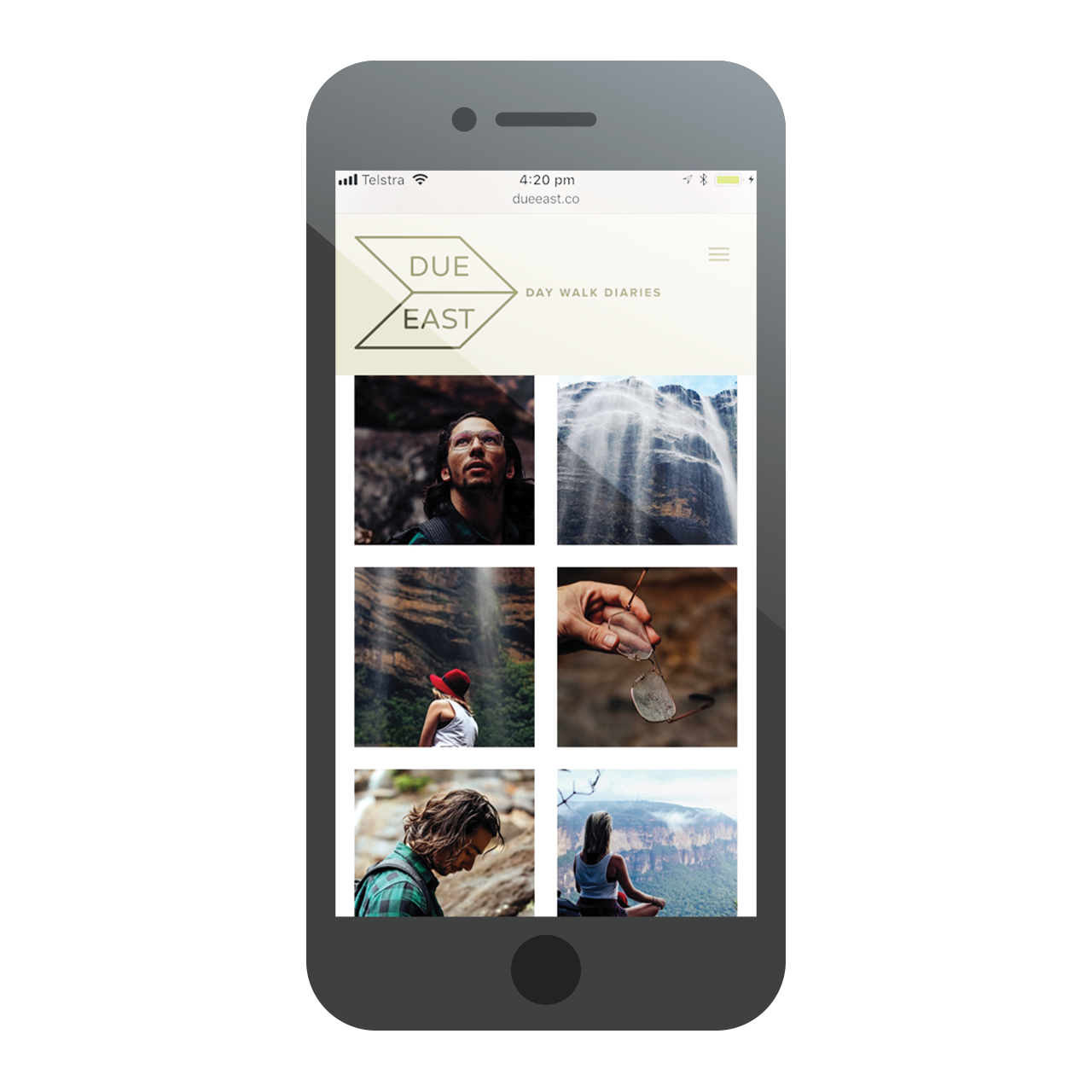
The colours chosen for the branding reflects that of the main content being nature.
The website was required to have a journal or logbook feel to compliment the copy that was written from a very personal and relatable perspective.
- Client: Due East
- Discipline: Branding, Art Direction, Photography