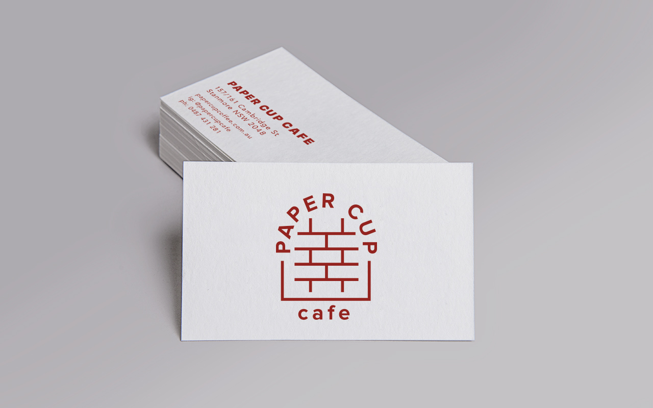
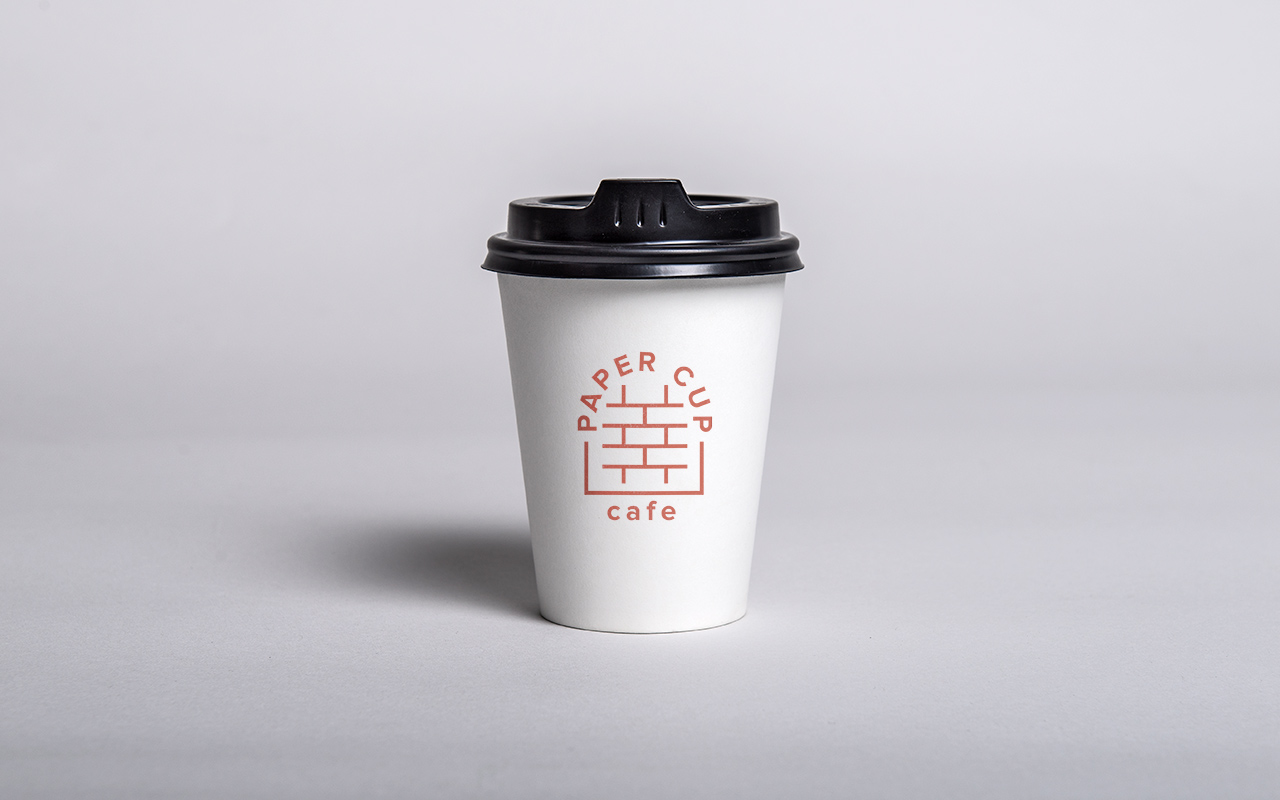
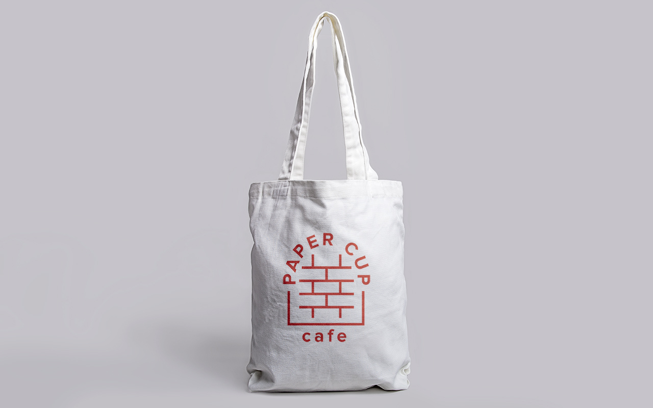
Paper Cup
I approached the local cafe which I felt needed an identity that would reflect the unique features of the building and location. The building has three distinct main arches integrated into the foundation formed out of red brick that creates a heritage feel. The identity that was formed pays tribute to the form and the structures which have been brought into a contemporary light due to the sharp vector lines and strong san serif typeface.
- Client: Paper Cup
- Discipline: Branding, Art Direction, Graphic Design